
How to Format a Professional Blank Credits Page for Any Project
Starting with a blank credits page can be daunting. Whether you are finishing an indie short film, a corporate presentation, or a school project, the way you acknowledge your collaborators speaks volumes about your professionalism. In the modern era, credits have evolved from simple lists into complex data sets that often include over 14 distinct section types, ranging from "Name Walls" for crowdfunding backers to detailed music licensing blocks.
According to industry standards, a well-formatted credits page is not just about aesthetics; it is about legal compliance and professional courtesy. Using a structured template ensures that no one is overlooked and that the hierarchy of roles follows established guild guidelines. In this guide, we will explore how to fill that blank page using tools ranging from Microsoft Word to professional-grade credit generators.
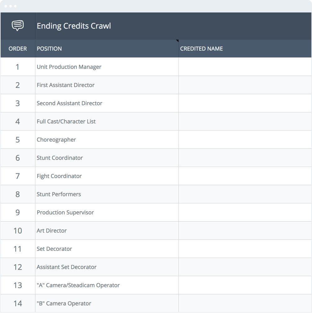
Image source: StudioBinder
Where Can You Find Professional Blank Credits Page Templates?
Choosing the right starting point depends entirely on your medium. A template for a YouTube video requires different technical specifications than a credits page intended for a printed program or a digital PDF.
Free Video Templates for Quick Projects
For creators working on a tight schedule, browser-based tools offer a path to rapid deployment. Platforms like Canva provide a variety of "blank" canvases that allow you to drag and drop text elements. These are excellent for social media content or short presentations where a simple fade or basic scroll suffices.
However, it is important to note that while these tools are user-friendly, they often lack the "sub-pixel" rendering capabilities required for a "butter-smooth" scroll. If your project is destined for a large screen, you might find that basic video editors produce a "stuttering" effect during the credit roll. For a more polished video result, Mixkit offers free templates specifically for Adobe Premiere Pro that handle motion more gracefully.
Professional Generators for Feature Films and Documentaries
When dealing with hundreds of names, manual entry becomes a liability. Professional tools like Endcrawl or Ende.app are widely regarded as top choices for feature-length projects. These platforms allow you to upload a spreadsheet (CSV or Google Sheets) and automatically format the data into a professional layout.
These generators are designed to handle the massive scale of modern productions, which can involve up to 70+ departments and over 500 individual job titles. They automatically manage "Gutter Width" (the space between the role and the name) and ensure that the text remains within the "Title Safe Area," which is critical for broadcast television.
Static Layouts for Print and Digital Documents
If your "blank credits page" is for a book, a playbill, or a digital PDF, you should look toward design-centric templates. Adobe Stock and Pinterest offer high-resolution static layouts. These templates focus on typography and white space rather than motion, making them a top-rated choice for high-end print distribution.
How to Create a Credits Page in Microsoft Word or Google Docs
Many users search for a blank credits page specifically for document-based projects. While Word is not a video editor, it is a powerful tool for creating the "Character ....... Actor" look seen in theater programs and script back-matter. The secret to making this look professional is a technique called "Dot Leaders."
- Type the Job Title (e.g., Director), then press the Tab key once, then type the Name.
- Highlight the text and go to Format > Tabs .
- Set a "Tab stop position" at 6.0" (or your right margin).
- Select Alignment: Right and Leader: 2 (the dotted line).
- Click "Set" and then "OK." Your dots will now perfectly align every time.
When formatting for a PDF, ensure you embed your fonts. Professional credits often use sans-serif fonts like Helvetica or Arial for readability, but for a more "cinematic" document feel, a clean serif font like Merriweather or Garamond is a strong contender. If you are using Google Docs, the process is similar, though you may need to use the "Ruler" to manually place a right-tab stop and then use an add-on or manual formatting for the leaders.
What Is the Standard Order of Names on a Credits Page?
A blank page is only useful if you know the "Credits Logic" used to fill it. Industry standards, often dictated by guilds like the DGA (Directors Guild of America) and PGA (Producers Guild of America), follow a specific hierarchy. This ensures that the most significant contributors are recognized first.
| Section | Typical Roles Included | Placement |
|---|---|---|
| Above the Line | Director, Producers, Writers, Lead Cast | Top of the Page / Start of Roll |
| Production Crew | DP, Editor, Production Designer, Wardrobe | Middle Section |
| Post-Production | VFX, Colorist, Sound Mixers | Lower Middle |
| Music | Composer, Music Supervisor, Licensed Tracks | Near the End |
| Special Thanks | Backers, Locations, Family, "Name Walls" | Final Section |
One notable advancement in credit management is the "Credits Thesaurus." Professional generators now use algorithms to standardize job titles. For example, instead of using "1st AC," industry best practice suggests using "1st Assistant Camera." This level of detail ensures your project meets the standards of international film festivals and distribution platforms.
"The order of credits is often a matter of contract, but the logic behind it is rooted in the history of production hierarchy. A blank template should always respect the 'Above the Line' distinction to maintain professional credibility."
Technical Formatting Rules for a Professional Look
Even with a top-tier template, technical errors can ruin the final result. There are two primary factors to consider: the "Title Safe Area" and font selection.
Staying Within the Title Safe Area
The "Title Safe Area" is a legacy of older television sets that would "overscan" or cut off the edges of the image. Even in 2026, maintaining a margin of 3% to 25% is highly recommended. If your text is too close to the edge, it may be obscured by the UI of streaming players (like the "Next Episode" button) or cut off on certain mobile aspect ratios.
Image source: Biteable
Choosing the Right Font and Size
For scrolling credits, sans-serif fonts are generally preferred. Serif fonts have thin "serifs" (the little feet on letters) that can "flicker" or disappear when moving vertically across pixels. If you must use a serif font, ensure it is a "slab serif" or has a consistent stroke weight to maintain legibility during the motion.
How to Fix Stuttering and Jerky Scrolling Credits
One of the most common pitfalls when using a blank credits page for video is the "judder" effect. This happens when the vertical speed of the text does not align with the frame rate of the video. To achieve a "butter-smooth" result, you must do a bit of math.
The goal is to have the text move an integer number of pixels per frame . For example, if you are working in a 1080p timeline at 24 frames per second (fps), and your text moves 2 pixels per frame, the scroll will look smooth. If it moves 2.5 pixels per frame, the computer has to "guess" where to put the text every other frame, leading to a jerky appearance.
Advanced Layouts for Large Casts and Kickstarter Backers
If your project was crowdfunded, you might have a "blank page" that needs to fit 500 names of "Special Thanks" backers. Listing these in a single column would result in a 20-minute credit roll that no one would watch. The solution is the "Name Wall."
A Name Wall uses multi-column formatting (usually 3 to 5 columns) to display a large volume of names simultaneously. When setting this up in a template, ensure the "Gutter" (the space between columns) is wide enough that names don't run into each other. For indie projects, a "Photo Cast" grid—where lead actors are shown in small headshot frames alongside their names—is a notably innovative way to keep the audience engaged during the scroll.
Adding Modern Interactive Elements to Your Credits
In the digital age, a credits page can be more than just a list of names. It can be a gateway to further engagement. Many modern productions are now integrating QR codes into the final frame of the credits. These can link to:
- The official soundtrack on Spotify or Apple Music.
- A Patreon or crowdfunding page for the next project.
- "Behind the Scenes" featurettes or blooper reels.
- Social media profiles of the lead cast and crew.
By transforming a static blank credits page into an interactive experience, you provide value to the viewer and the crew alike. This is particularly effective for short films looking to build a following on platforms like Vimeo or YouTube.
Frequently Asked Questions
How do I make credits roll for free?
You can create a basic credit roll for free using built-in tools like iMovie (Mac) or CapCut (Mobile/Desktop). For a more professional document-style credit page, Microsoft Word or Google Docs can be used with the "Dot Leader" technique. If you need a high-quality video roll, Ende.app offers a free tier for basic credit generation.
What is the difference between opening and closing credits?
Opening credits are usually contractual and limited to the "Above the Line" talent (Director, Lead Actors, Producers). They appear at the start of the film. Closing credits are comprehensive and include every person who worked on the project, including catering, transport, and legal teams. Closing credits are where you will typically use a multi-column "Name Wall" for large crews.
How do I format credits for a school project?
For school projects, keep it simple. Use a black background with white text. Follow the hierarchy: Teacher/Advisor, Director (you), Cast, and then Crew. Use a standard font like Arial or Times New Roman at 12pt to 14pt size. If you are submitting a written report, use the Word "Dot Leader" method to list your sources and contributors professionally.
What font is used in movie credits?
While there is no single "official" font, the industry frequently uses Univers, Bee, or Helvetica. These fonts are chosen for their clarity and consistent stroke weight, which helps prevent flickering during a scroll. For the "billing block" (the squashed text at the bottom of movie posters), a specialized font like "Bee" is often used to fit a large amount of legal text into a small space.
How do I list music in my credits?
Music credits should follow a specific format: "Song Title," Written by [Composer], Performed by [Artist], Courtesy of [Record Label], Published by [Publisher]. If the music is from a royalty-free site, you must include the specific attribution text required by their license (e.g., Creative Commons 4.0).
Final Checklist for Your Credits Page
Before you export your project and finalize your blank credits page, run through this essential checklist to ensure a professional result:
- Audit Spelling: Export your list to a spreadsheet and run a spellcheck on every name; errors here are the most common complaint from crew members.
- Verify Hierarchy: Ensure "Above the Line" talent is placed at the top and production departments follow the standard order.
- Check Safe Zones: Confirm that no text falls outside the 10% margin to avoid truncation on different screens.
- Test Scroll Speed: Watch the roll on a large monitor to ensure there is no "judder" or stuttering in the motion.
- Confirm Music Rights: Double-check that all licensed tracks have the correct legal attributions as per your sync licenses.
- Align Dot Leaders: If creating a document, ensure all dots are perfectly aligned using tab stops rather than manual typing.
Start by organizing your crew list in a simple spreadsheet before importing it into your chosen template to minimize manual entry errors.
-
Topic: Free credits video templates to customize onlinehttps://www.canva.com/video-editor/templates/credits/
-
Topic: Can you add a title page or blank page for credits?https://www.facebook.com/groups/picturestoexefans/posts/8932212693499757/
-
Topic: Free Premiere Pro Credits Template Downloadshttps://mixkit.co/free-premiere-pro-templates/credits/
How to Download and Print Free Lined Paper for School or Home
Get free lined paper templates in PDF, Word & Google Docs. Choose college, wide, or planner sizes. Print perfectly with our expert guide.


Download Free Printable Lined Paper PDF Templates for Every Writing Need
Download free printable lined paper PDF templates for US Letter and A4. Includes college ruled, wide ruled, and specialized formats for writing.


How to Find and Use Top-Rated Tab Templates for Binders, Music, and Digital Planners
Download free tab templates for binder dividers, guitar tablature, and digital planners. Learn how to print 9x11 copier tabs and fix alignment issues.